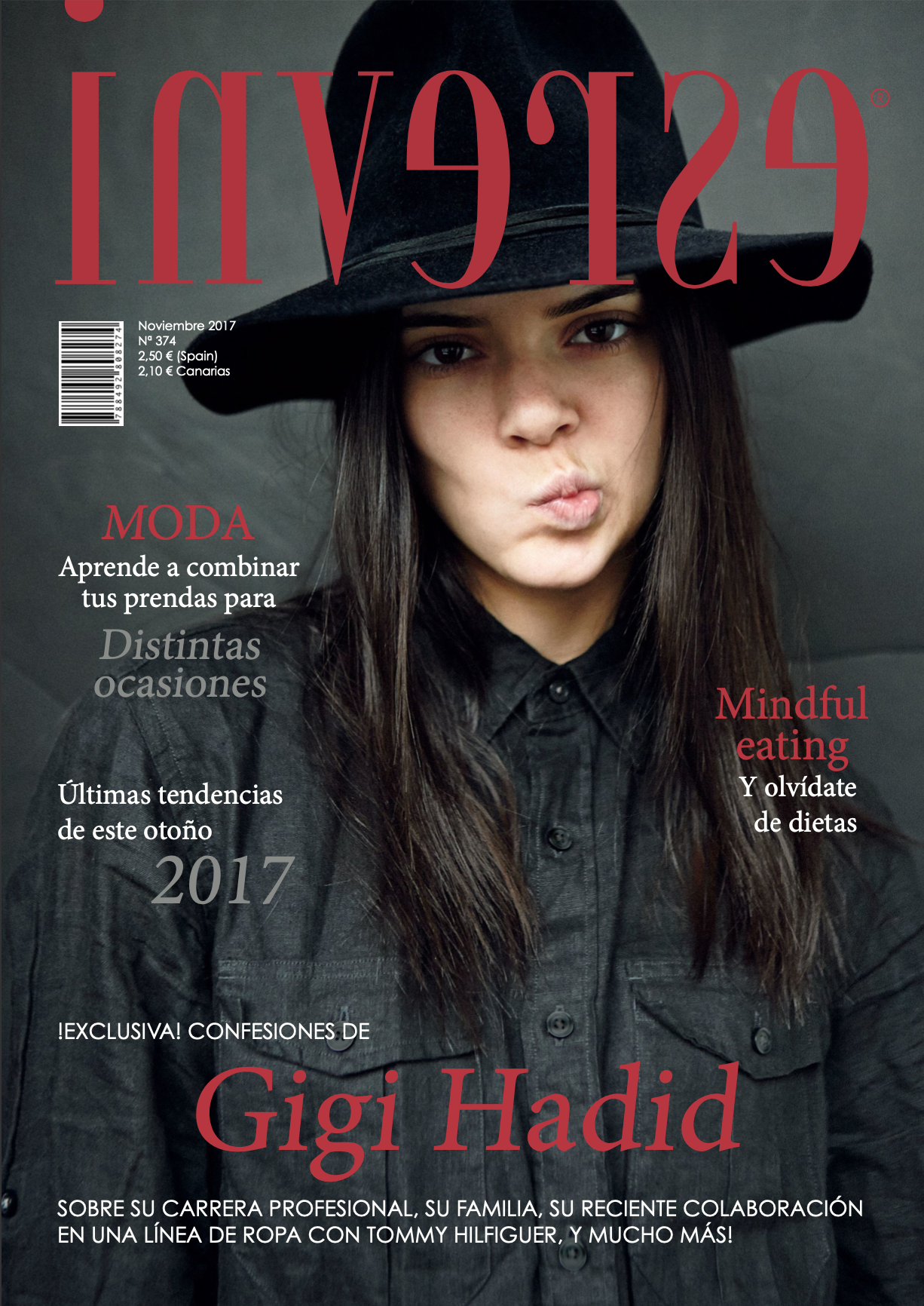
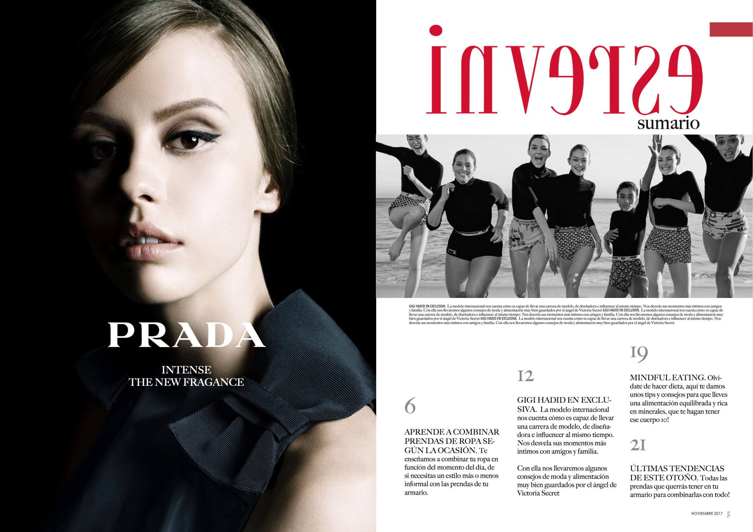
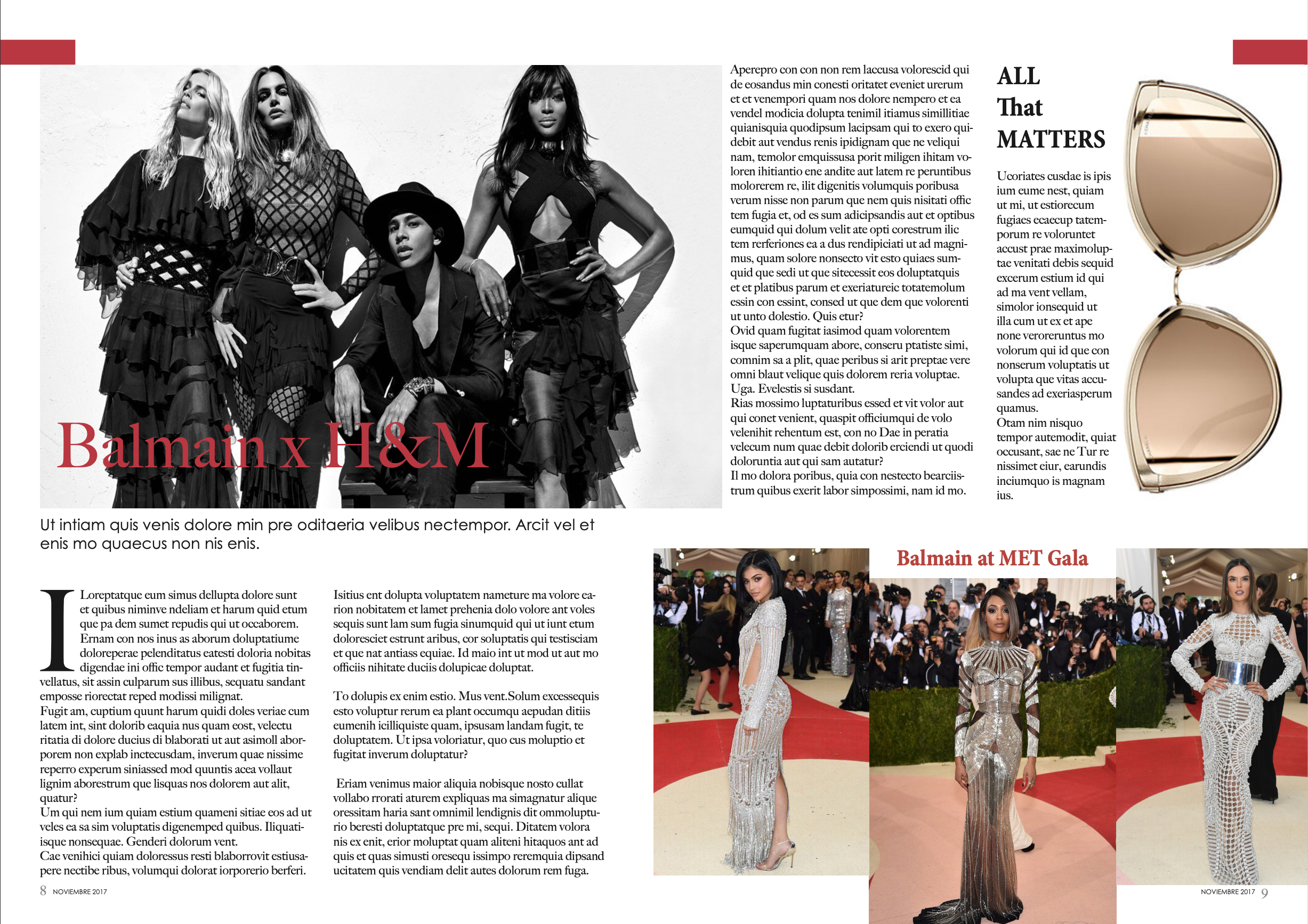
Inverse is shown as a fashion magazine in which graphic design in the sector is analyzed.
The values of elegance, power and sophistication are the ones that distinguish the magazine, so it is important to design a logo and use colors and fonts according to what is intended to be communicated in it.
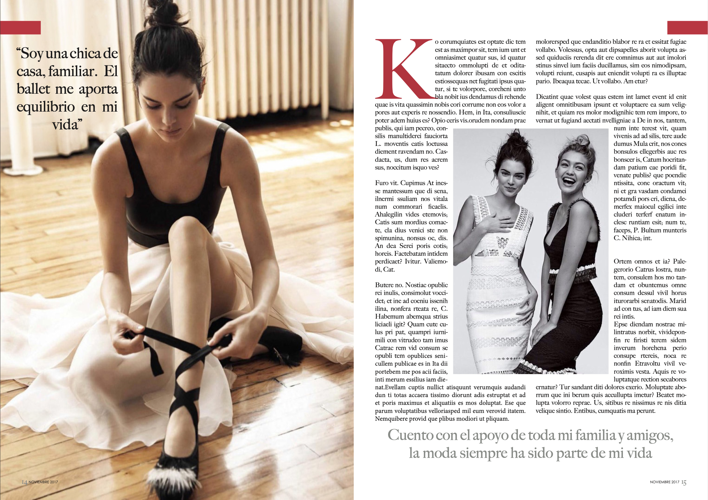
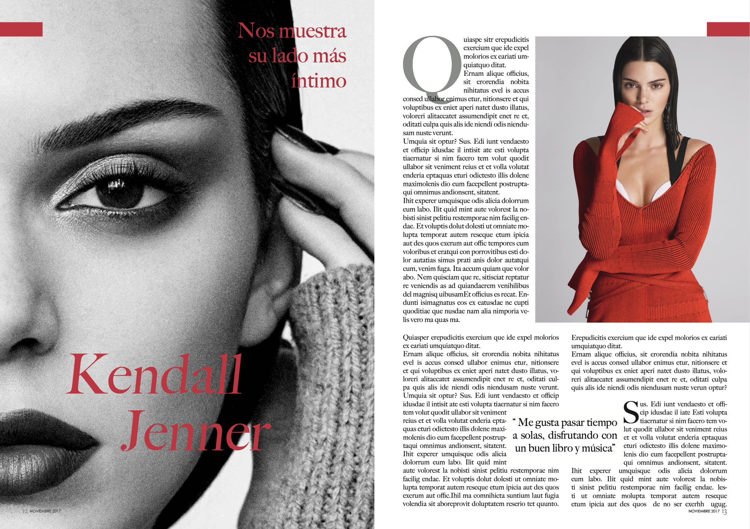
Depending on the hierarchy of importance of the content, different fonts, font size and colors are used to guide the reader.
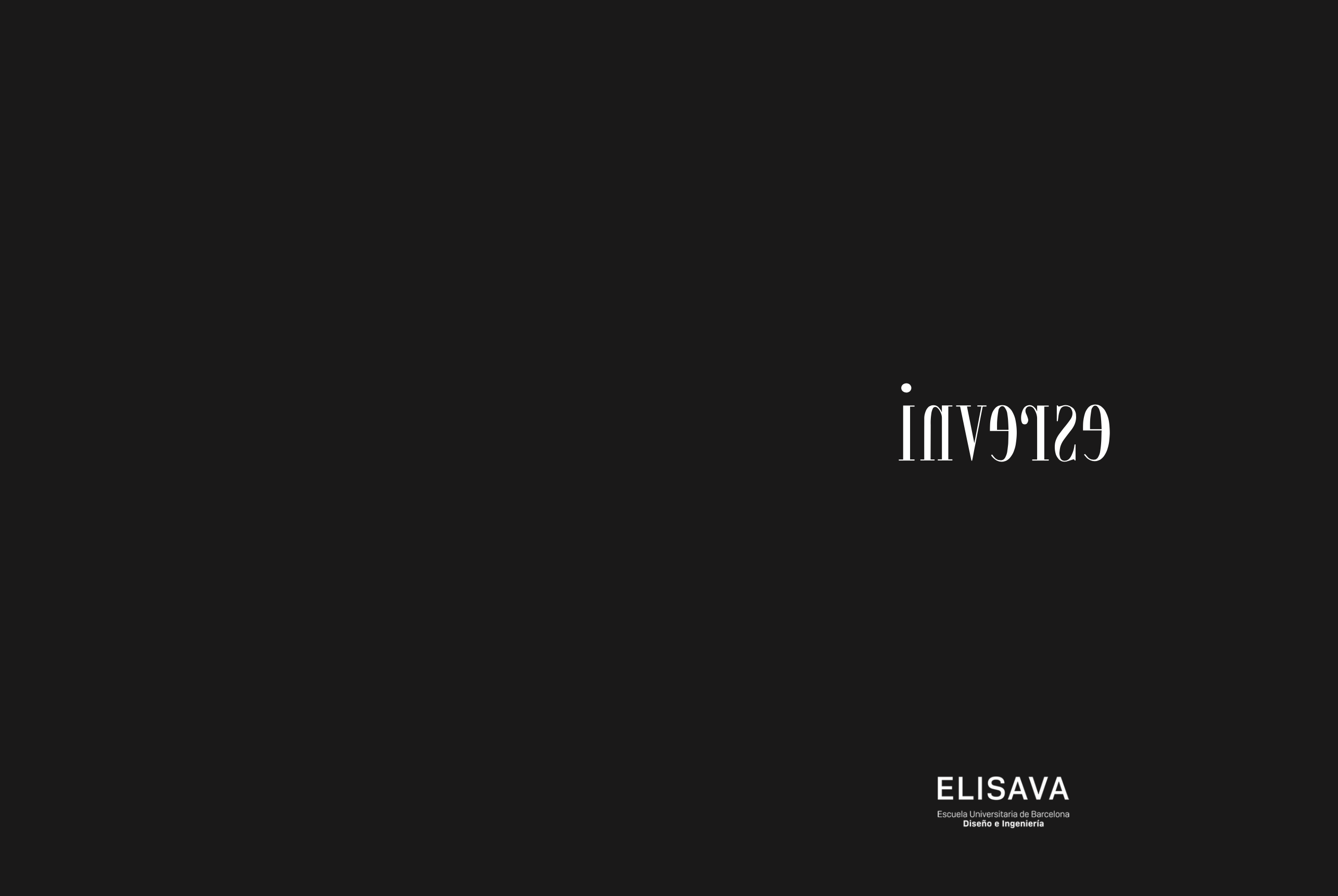
The inverse logo has been designed to be able to adapt to any background, cover and color required. Likewise, in reference to the name of the magazine, the letters of the logo are shown inverted.